CCT460 Portfolio Site (HTML5, CSS3, Boot Strap5)
Process
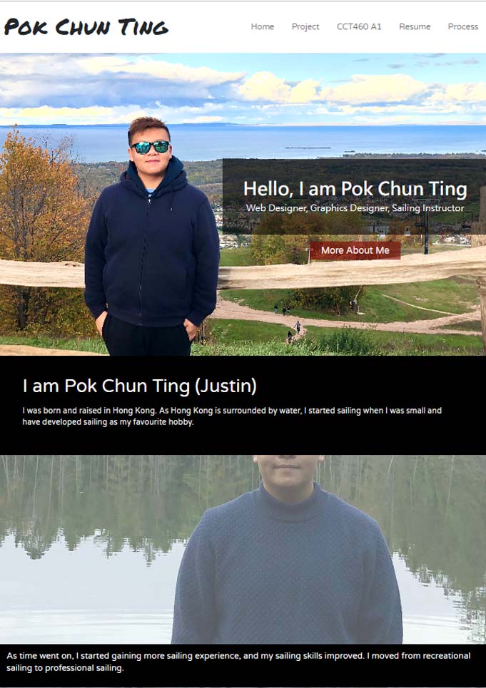
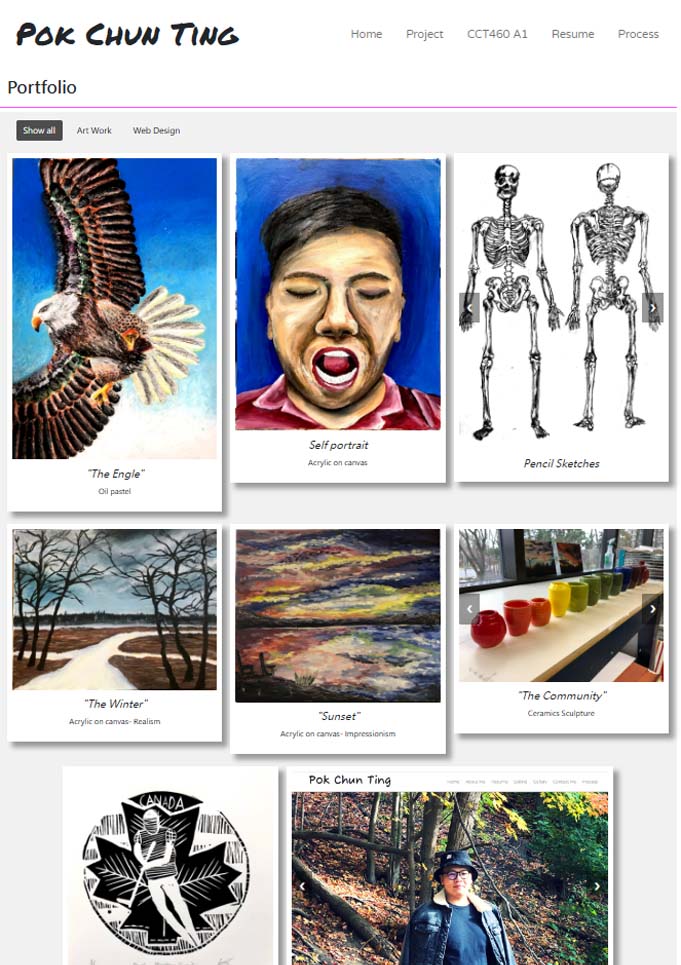
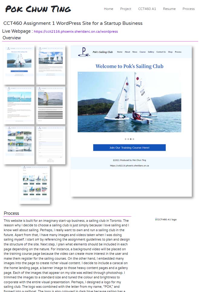
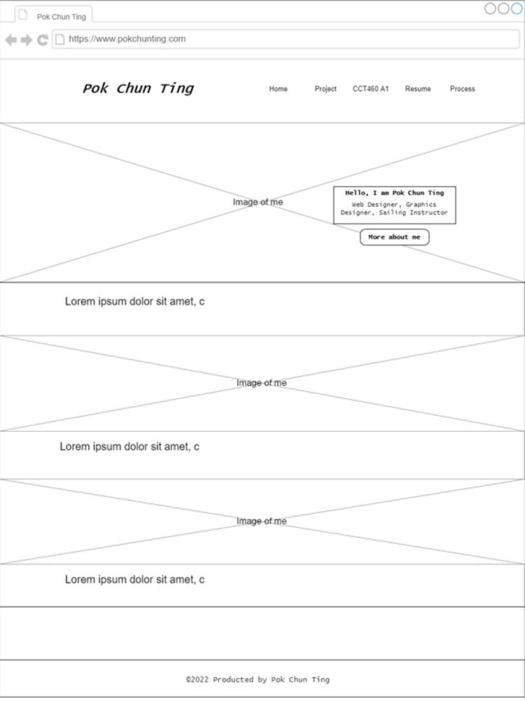
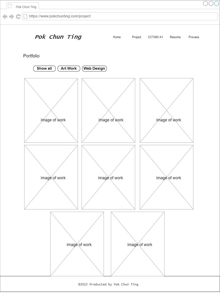
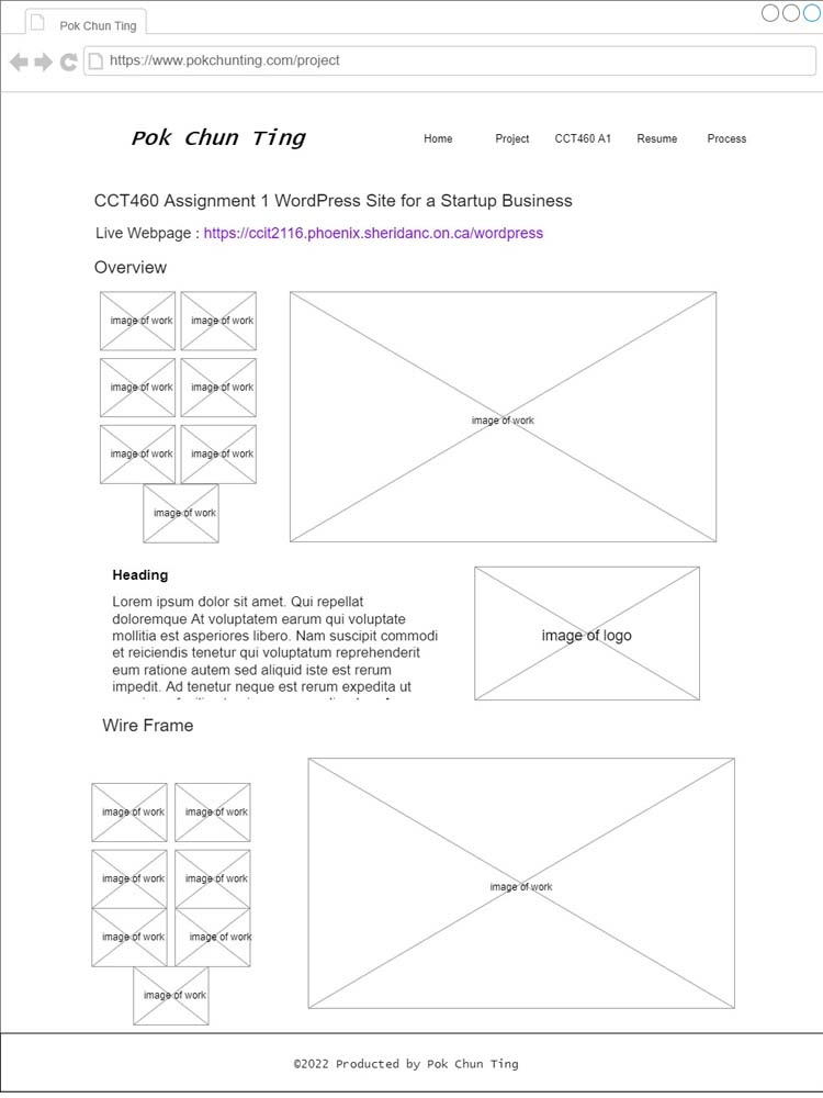
This project is about building a self-portfolio website. After reading and understanding the assignment brief, the first question that comes to my mind is how to illustrate diversity and my identity. This question remains in my mind throughout the entire planning and the design project. To tackle this question, I decide to showcase myself through strong visual communication. With that said, I focus on choosing the appropriate images and editing them to enhance their quality. For instance, the three images that I picked for the home page include a colourful landscape and a clear image of me. Also, I keep the images in the same section in the same size or at least the same width, if possible, to enhance the consistency. However, I decided to use two different widths to show artworks and websites on the project page. This is because there is more content for the website section, and its details are relativity more important than those of the artwork. So having a bit more width to showcase the website are more suitable. Further, since there are many images on the page, I organize the project page in a portfolio setting with slideshows and the CCT460 assignment page with a gallery setting. These two settings allow those images to sit tidy and organized. I added box shadowing to the images on the project page because it makes those projects visualize like those artworks posted on a bulletin board.
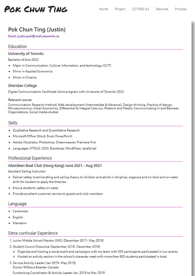
Regarding the page's design, I visited many other self-portfolio pages online to seek inspiration. Through my observation, I found that those successful pages contain two important features: simplicity in design and clear content presentation. I decided to keep the header, body and footer simply. However, I embedded a large black and stylish h1 in the header to balance between the simplicity of design, and an eye catches h1. Besides, when I got to the inner content page, I found that the simple design does not work well with heavy content. I embedded a light grey background to the portfolio on the project page to make the visual presentation richer. Perhaps, I added a solid pink border under every sub-title to enhance the richness of the frame. On the other hand, to enhance the clarity of the content, colour contrast and fonts are significant regarding clarity. For example, black text on white or light grey background and white text on black background. Besides, I used different font sizes to emphasize the subheading hierarchy on the resume page. I also applied box shadowing to the resume page to make it more like a resume printed on paper.
Moreover, I referenced the AODA and the CRTC’s requirements to enhance the accessibility and usability of the page throughout the entire website building process. These criteria include colour contrast, alternative texts on images, functional external links, readability, and font sizes. After the first draft was done, I used the google WAVE program to evaluate my page to ensure accessibility of the page, ensure there is alternative text with my images, and there is no colour contrast, missing links or other issues.
Wireframe
Conversion goal
Attract potential employers to contact or hire me after viewing my website
The first conversion goal of the site is to attract potential employers to contact or hire me after viewing my website. Since this page is a presentation of myself and showcases my projects, it demonstrates my knowledge and abilities. One of the major purposes of this website is to present me to potential employers and seek work opportunities. To achieve this goal, I organized and designed the page to attract users' interest from a general perspective to a more technical manner. The site's first impression is really important to users because it is also their first impression of me. I embedded a full-screen image that includes me and a colourful landscape to give a good impression to the viewer. There is also a button below the spotlight boxes that directs users to a brief introduction of me. Next, I have a high visual portfolio on the project page to attract users' interest in my work. After all visual attractions, It transition into a content attraction based on the resume page that illustrates my background, qualification and past experience. Until this point, I believe the user or potential employees had a fair amount of information or interest about me. They will contact me through the email that I displayed on the resume page for further discussions.
Keep the user engaged through their entire site visit
The second conversion goal is to keep the user engaged through their entire site visit. This entire site is all about me and my projects. I try to think from a perspective in which the user has no knowledge about me before the visit. I find that simply showcasing the source code of my projects and resume will not may them engaged with the content. To make the user more engaged, I try to visualize my project as much as possible and embed many images on the site. Besides, having too many images will also lose users’ interest. This is the reason why I embedded a gallery on the CCT460A1 page to showcase the design and the wireframe. It allows users to have an overview of all pages and click on specific images to view its detail in a larger size.
Share my page with another user
The third conversion goal is user share my page with another user. On my page, I showcased a lot of work, both artwork and website. I hope users will be interested in my work and share it with their friends or reference them in their own work. To achieve this goal, I try to show the process of building my website and more dimensions of my artworks. For instance, there is a page on CCT460 assignment 1’s project that explains the design and its details. I also include a slideshow to show some of the artworks from muti perspectives.
Segmentations
The first segmentation of users will be the source that they come or directed from. The link to my webpage will be placed on different job searching platforms and some of my other personal site or social media pages. The referring source can identify their amount of understanding and knowledge of me before visiting my site. For instance, if the users were directed from a job searching platform, they might be potential employers with some expectations from the site. If the users were directed from my personal Instagram page, they might be a friend who wants to know more about me in general.
The second segmentation will be the behaviours of the user. If the user spends more time on the high visual images page and very little time on the heavy text content page, this user is more likely to be attracted by my works instead of wanting to know me. Their behaviours are important to me because these data will help me to adjust the content and the design of the page. For example, if the heavy texts content page had a large bounce-over rate, I will try to add more images to attract viewers. Also, if people quit without visiting other pages after landing, I will enhance the attractiveness of the homepage to give viewers a better impression.
The last segmentation will be the path of visit. The path of the visit is important to the page. My page was designed with a certain path of visit, starting from a general introduction to an in-depth perspective of me. The data can prove and evaluate my assumptions, right or wrong. If the data shows people bounce from the home page to the CCT460 A1 page first, I will more buttons or links to direct them back to my designed visiting path. On the other hand, If a user just directly jumps to the resume page after landing on the home page, it indicates that this user might have a specific purpose for visiting my page or is revisiting my page just for specific information.
SEO/SEM and Keyword Plan
First, I considered google images' best practices in the design of the site. All images that I placed on this site are well-edited and of high quality. Apart from the background images, I placed context beside the image to describe it. For instance, in the portfolio section of the project page, I place context to describe every single image. Next, I followed the rule of placing images according to google and including alternative attributes on every image to enhance accessibility.
Moreover, I ensure the site's browser compatibility. I tested the site with different browsers and devices to ensure its compatibility. I also kept all my HTML code and CSS code clean to eliminate unnecessary codes. On the other hand, I considered the accessibility of the site as mentioned in the process part above. I also make the links in the site crawlable. I used proper tags in all codes to enhance Google's understanding. Besides, to optimize the search engines, I cooperate proper, meaningful, and descriptive keywords to every page, title, heading, image's alternative text, and links. These help the system understand the page better.