CCT460 Assignment 1 WordPress Site for a Startup Business
Process
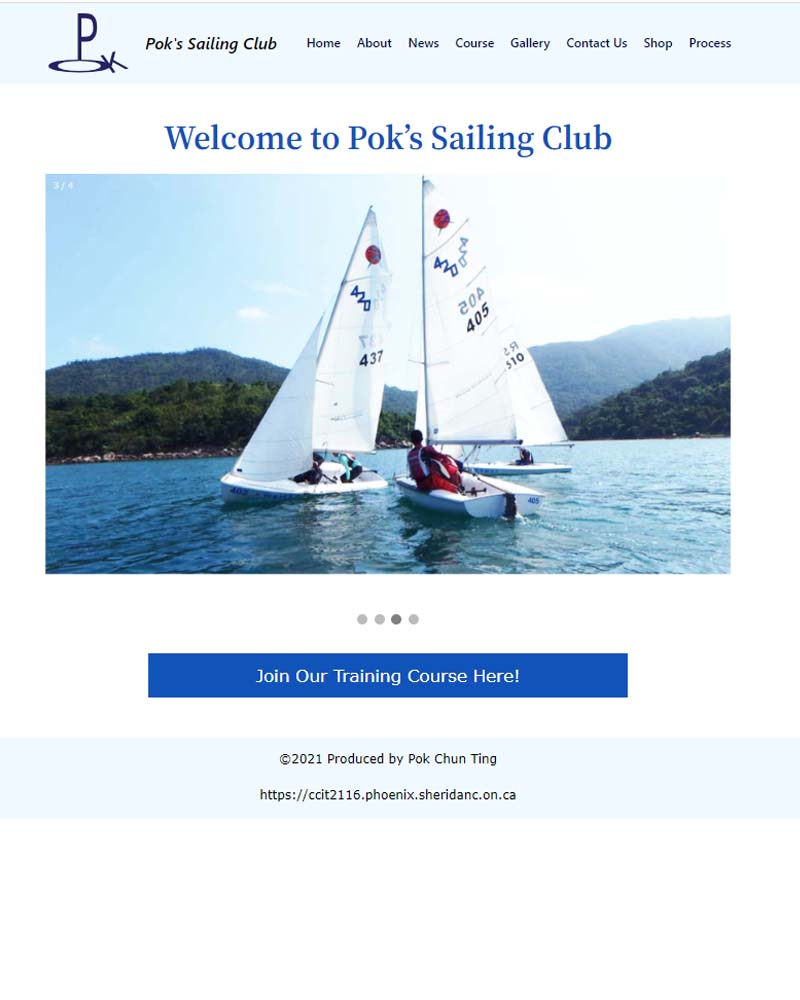
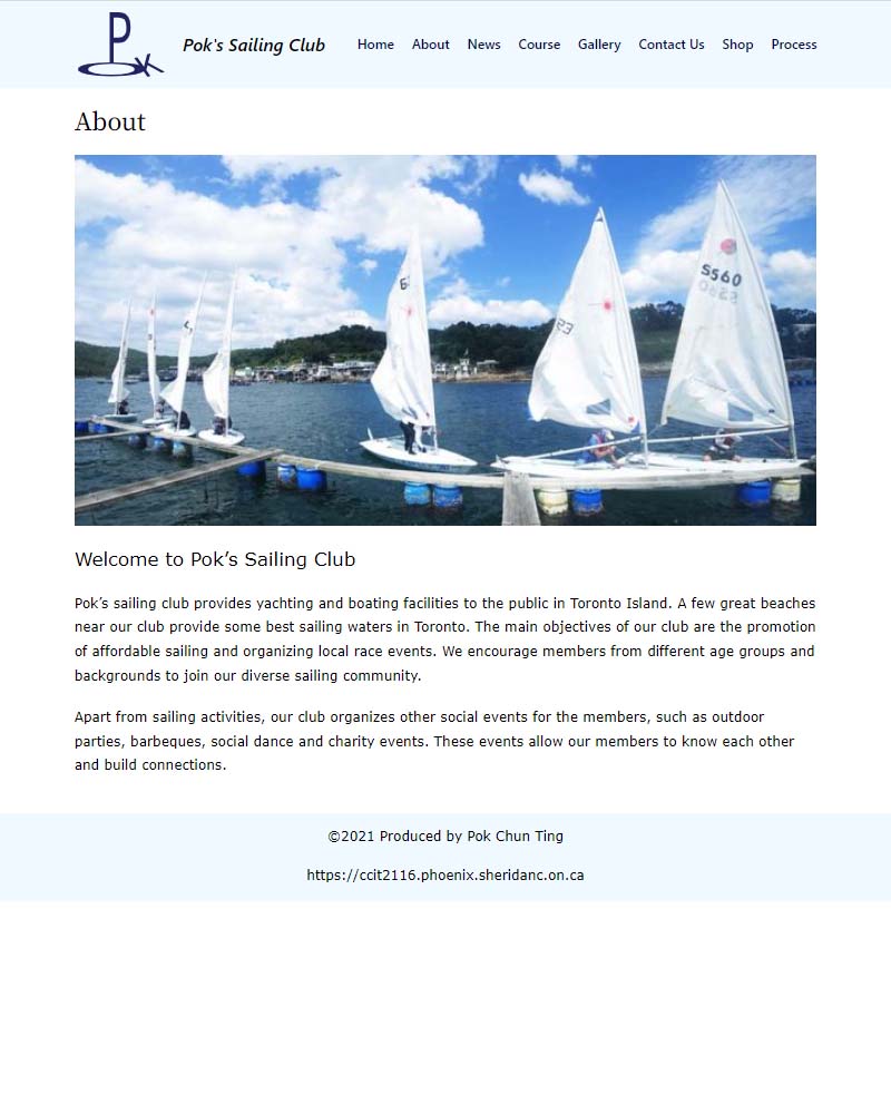
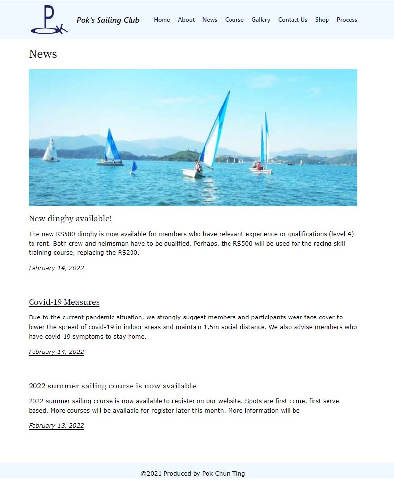
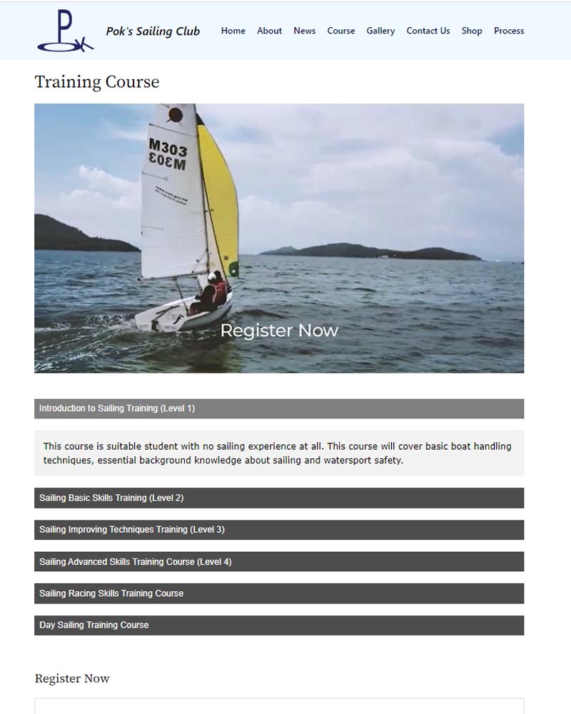
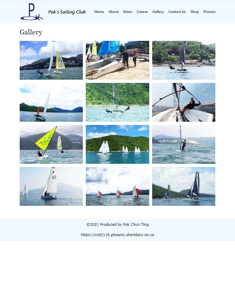
This website is built for an imaginary start-up business, a sailing club in Toronto. The reason why I decide to choose a sailing club is just simply because I love sailing and I know well about sailing. Perhaps, I really want to own and run a sailing club in the future. Apart from that, I have many images and videos taken when I was doing sailing myself. I start off by referencing the assignment guidelines to plan and design the structure of the site. Next step, I plan what elements should be included in each page depending on the nature. For instance, a background video will be placed on the training course page because the video can create more interest in the user and make them register for the sailing courses. On the other hand, I embedded many images into the page to create richer visual content. I decide to include a caracal on the home landing page, a banner image to those heavy content pages and a gallery page. Each of the images that appear on my site was edited through photoshop. I trimmed the images to a standard size and tuned the colour and brightness to corporate with the entire visual presentation. Perhaps, I designed a logo for my sailing club. The logo was combined with the letter from my name, “POK,” and formed into a sailboat. The logo is also coloured in dark blue because sailing has a strong connection with the sea. For the same reason, the header was in light blue, representing the sea and the sky.
Wire Frame
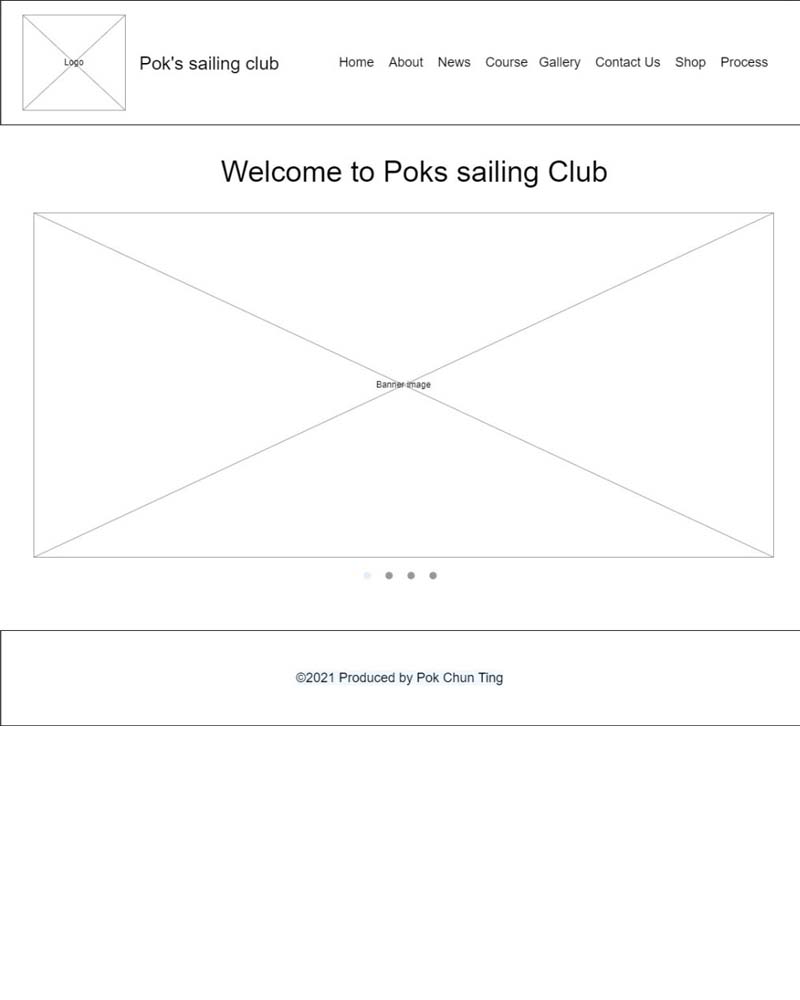
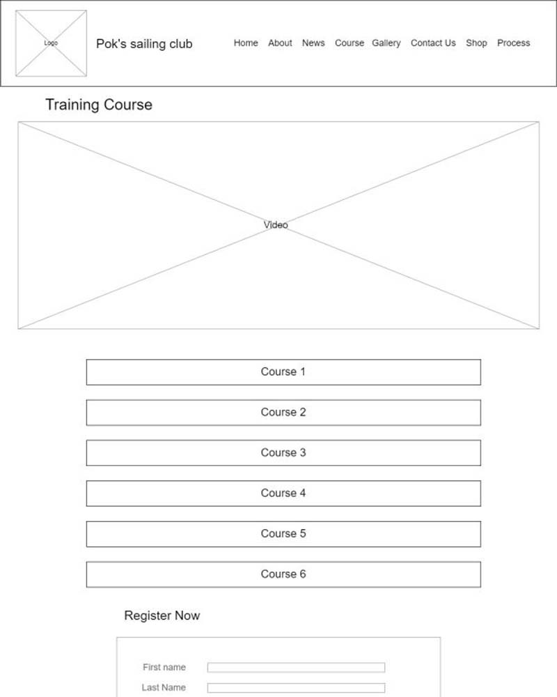
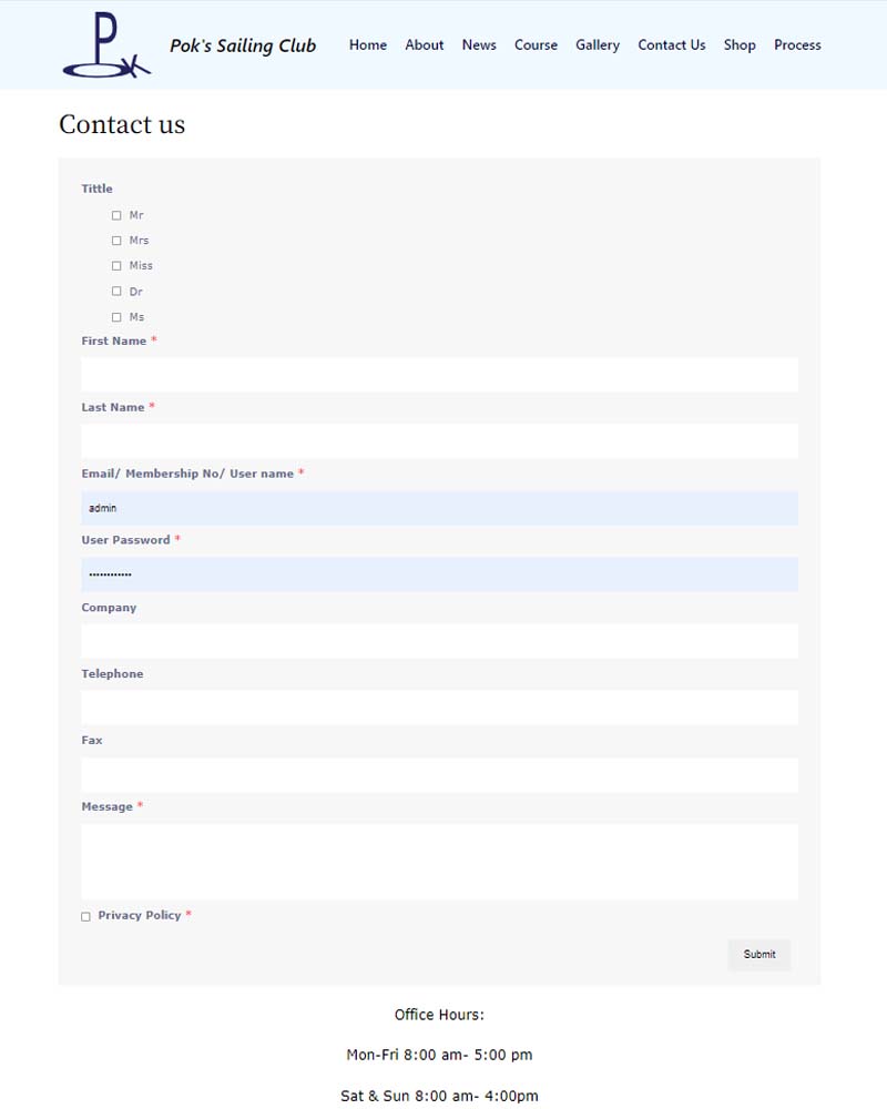
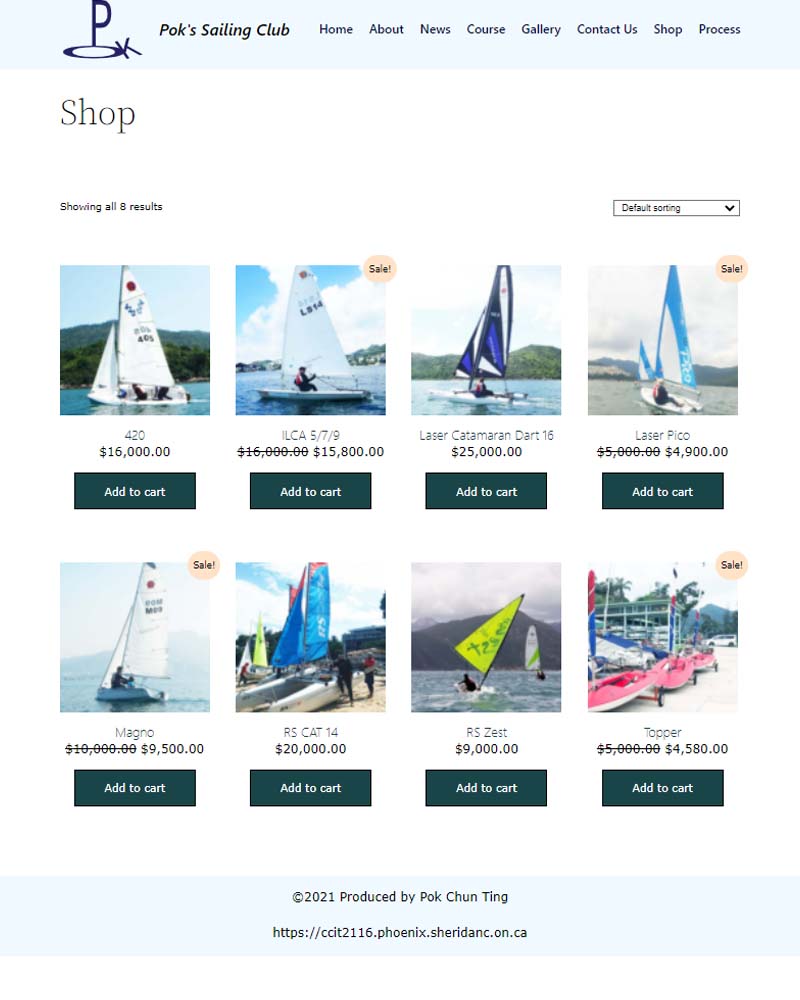
Further, I referenced the w3shool and embedded the collapsible on the training course page. This is because if all course details were listed out on the page, it would be hard for users to read and be confused. Having a collapsible allows users to navigate their course in an effective and easy manner. On the other hand, I applied the WooCommerce and the user registration plugs introduced in class onto the shop page, contact us and course registration place. I decided to place a slide shop with some banner images on the home page. I did try adding other elements such as a video or some products to the home page, but end up I found those elements may not be suitable for the home page because they might be too much. I did try adding some captions to those images, but I found that the text might be hard to read. So end up I decided to keep the homepage simple because there will be more elements that appeal to and attract users to sailing in the inner page. Having a clean visual presentation is enough for the home page.
Accessibility
With the consideration of the accessibility and usability. I referenced the AODA and the CRTC’s requirements. These include the degree of colour contrast, alternative texts on images, functional external links, readability, and font sizes. I used the google WAVE program to evaluate my page to ensure accessibility of the page, ensure there is alternative text with my images, and there is no colour contrasting or other issues. For instance, I used an 18px font size for my inner text page because this font size is easy to read. Besides, there is always strong colour contrast between the texts and the background. For example, the site logo, title and global navigation are placed on the light blue header, all these components are in dark blue to create a strong contrast. Texts on the video were in white because the video is in a relatively dark tone. I added a half-transparent black background to white texts on the video to create a stronger contrast. Other than that, all page layouts are consistent, including font, colour, header, and footer, enhancing usability.